
Is CPI a good measure of affordability?
No....no it's not.

June Consumer Price Index (CPI) numbers just came out, the headline number is down 0.4%. Predictably two camps emerged, those celebrating the decline as justification for the President’s work, and those claiming that the decline is temporary and largely driven by energy prices (and thus should not show the President is doing a good job).
Pundits and politicians have for years used CPI as a proxy for affordability for the American public. Unfortunately the headline number and the actual experience of American consumers can feel completely disconnected.
For example, if CPI is up 3% over the year, consumers don’t see a 3% increase in everything they purchase. They might see a 15% increase in fuel prices and little if any increase in the food they buy. The emotional feeling of 15% higher fuel prices hits harder than a headline number of 3%.
June 2026 had CPI down 0.4%, but consumer prices remain much higher than they were several years ago.
CPI-U, which is the headline inflation index, has nearly doubled since 2000. I’ll just call it CPI from here on. This chart alone is used in shock-and-awe campaigns to reach political goals. But the thing to keep in mind here is that the index measures cumulative changes in consumer prices. This headline number tells us how quickly that index is changing. Neither one directly measures affordability, even though many interpret that it does.
My household budget and whether it feels squeezed is the central measure of affordability. If I don’t drive, fuel prices increasing only affect me if they cause other prices to go up. If I’m a vegetarian, meat prices have no impact on my life. If I have three kids and food prices increase, it really stings.
Prices and affordability are tightly connected, but they are not the same thing. I’m going to briefly explain what CPI is, then tell you why it is a terrible measure of affordability.
This is my very first post on American Metrics. Thanks for reading. Each week I will be posting one longer form article like this and one chart of the week.
What is CPI?
The Bureau of Labor Statistics (BLS), who compiles CPI data, defines CPI as:
The Consumer Price Index (CPI) is a measure of the average change over time in the prices paid by urban consumers for a market basket of consumer goods and services.
BLS says that its headline inflation number, CPI-U, represents 93% of the US population. It takes the spending weights from the Consumer Expenditure Survey and prices from stores, service providers, and rental units. Then it does some sampling magic and creates the average change. Here is a graphic of the full process.
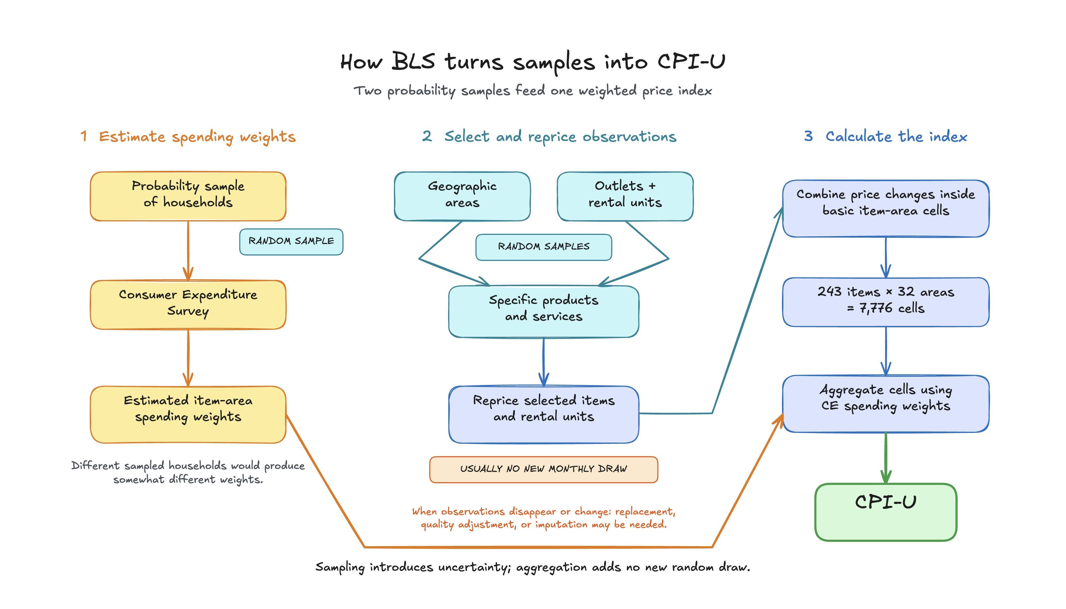
For prices, BLS collects 90,000 commodity-and-service price quotes from about 21,500 outlets, plus approximately 8,000 housing quotes each month. Households are selected at random and surveyed with either an interview about their expenses or a diary, which better captures smaller expenses.
Sampling is involved because it isn’t practical to collect every price paid or every household’s data.
These two samples are used to create a single national picture of prices and household spending. After the sampling and calculations are done, you end up with a single number, CPI, to represent average price changes across urban America.
A very brief history of CPI
CPI was originally created after World War I as consumer prices rose rapidly. BLS conducted family expenditure studies in 92 industrial centers between 1917 and 1919, then began publishing city indexes in 1919, and later created this national index we all know and love today.
The original name of this index in 1919 was the “Cost of Living Index”. The idea was to estimate the cost of living in order to keep wages rising to meet household expenses. Over time, BLS realized that this name was hard to live up to. In 1945, the name was changed to the Consumer Price Index. Since then, there have been many attempts to make CPI into a better measure of cost of living. Unfortunately, none of these attempts have turned CPI into a measure of whether a household can afford its life.
Why CPI is not affordability
My belief is that CPI is not, and never will be, a good measure of household affordability. Consumers know and experience their own condition and the conditions of the people they know. BLS combines spending data from urban consumers across the US into expenditure weights, then uses those weights to calculate a national average of sampled price changes.
Affordability is also not prices. CPI does not measure:
Real costs of purchasing a new home
Taxes
Changes in wages
Number of jobs or hours worked
A simple formula for affordability might be:
Affordability pressure = required household costs ÷ available household income
CPI does not fully describe either side of this equation. Food, clothes, and shelter are required, but there is a massive range of each available to each person or family. If I work overtime this month but not next month, my income materially changes.
In my view, there are three critical issues with using CPI as a measure of affordability:
CPI shelter costs are not the same as the cost of buying a home
A national average may not resemble any particular household
CPI is a point estimate with sampling uncertainty
Shelter Costs ≠ Home Prices
BLS collects rental prices, and when someone owns a home, it estimates the rent that the home would produce and uses that as its shelter cost. This, of course, has some problems. A mortgage payment is not rent, and when you choose to get your mortgage can change your monthly spending on housing significantly.
As you can see in the chart above, BLS publishes rent and owners’ equivalent rent indexes. Owners’ equivalent rent estimates how much homeowners would have to pay to rent a comparable home. The red line shows the estimated mortgage payment required to buy a comparable home.
While rent and owners’ equivalent rent have risen relatively gradually, the estimated cost of buying a new home has gone up much faster.
About 65% of occupied US housing units are owner-occupied. Many existing homeowners are protected by mortgages started when rates and prices were lower. Someone trying to buy the same home today faces a very different calculation.
A national average is not a household
In 1952, a study by Gilbert Daniels was conducted for the Air Force. Daniels examined 4,063 airmen across ten physical dimensions, such as chest circumference, sleeve length, and waist circumference. After averaging each dimension, he determined that none of the airmen fell within the selected “average” range on all ten measurements.
This is an old story that I’ve heard often, but it rings true especially here. The national CPI can be statistically precise while still being unrepresentative of a particular family’s affordability problem.
To see how this applies to CPI, I used the 2024 Consumer Expenditure Survey to calculate the average urban consumer unit, which is roughly the BLS version of a household. Notably this is different from the BLS process, but it shows the issue just the same.
In 2024 the average urban consumer unit had 2.44 people, 0.55 children, 1.32 earners, and 1.80 vehicles. The reference person was 51.8 years old, and the unit had before-tax income of $106,715.
When I was a kid in the 90’s everyone joked that the average family had 2.5 kids, which is of course impossible just as it’s impossible to have 0.55 children or 1.32 earners.
To make these numbers make sense I then tried to turn these numbers into an actual household. I rounded the unit to two people, one earner, and two vehicles. I allowed the age of the reference person and household income to be within 20% of their averages.
This gives us a fairly wide age range of 41 to 62 and an income range of about $85,400 to $128,100.
About 36% of urban consumer units matched the age range. Adding income reduced that to 6.6%. Requiring two people brought it down to 2.1%. Adding one earner reduced it to 0.5%, and requiring two vehicles left approximately 0.2%.
To be clear, this does not mean CPI represents only 0.2% of households. BLS does not use these characteristics to calculate CPI, and this exercise does not recreate the CPI basket.
So many of our national metrics focus on averages, but an average can describe a population without describing any particular member of that population. CPI has the same basic limitation when people try to apply it to their own lives.
Its spending weights describe urban consumers collectively. They do not describe the budget of a particular homeowner, renter, retiree, vegetarian, commuter, or family with three children.
Point estimates hide uncertainty
BLS reports a single number each month. This number is created by sampling both prices and households. If BLS runs this sampling again, they will get a slightly different CPI number.
In modern times we call this sampling error, and in statistics this is usually called a confidence interval. BLS publishes standard errors, but it does not report the interval next to the headline CPI number. BLS samples two areas, prices and households. Uncertainty is introduced in each area.
To illustrate sampling error and CPI I took a stab at showing it here. Note only shows uncertainty in pricing (not households).
The chart shows the median monthly change in CPI each year along with the 95% confidence interval. I added a 0.2% benchmark as a practical rule of thumb. It isn’t an official target. The Fed targets 2% annual inflation.
In 2025, for example, the median monthly change was 0.25%. This is well over the target, but as you can see the sampling error reaches below the point estimate from BLS.
One way to view the confidence interval is that there are a range of plausible values around the point estimate. Under a simple approximation of our model above, there is roughly a 11% chance that median monthly change of CPI in 2025 was actually below the 0.2% benchmark. This is simplistic, but it shows how the published numbers don’t give the whole story.
This of course does not mean the BLS number is wrong, but it is very important to say that CPI is a probabilistic estimate, not unlike surveys and models for predicting the outcome of a political races.
This does not make CPI useless. The national index is statistically very precise. But when a change is small, its sampling error can make it harder to say whether it is above or below a benchmark.
More importantly, making CPI more statistically precise would not solve the affordability question. BLS could measure the national average with absolute perfection and it still would not describe the budget of a particular family. Consequently, everyone would still find that the number has little meaning for their life.
The wrong map for the territory
In March 1914, before BLS started national CPI reporting, J. W. Sullivan writing in The New York Times noted that the Bureau of Labor’s (as it was then called) price bulletins were:
“inadequate as a basis for percentages representing the general cost of living.”
— J. W. Sullivan, as reported by The New York Times, March 2, 1914
The statistical data collection and processing by BLS has improved immensely over the years. And yet we still find ourselves in a similar situation to 1914. Statistical averages routinely fail to answer the simple question: can I afford to live my life?
CPI is not and probably never will be a true affordability measure. In the coming weeks I’m going to cook up a, hopefully better, measure of affordability for Americans.